


Ki
ngs
co
tee
st
ate


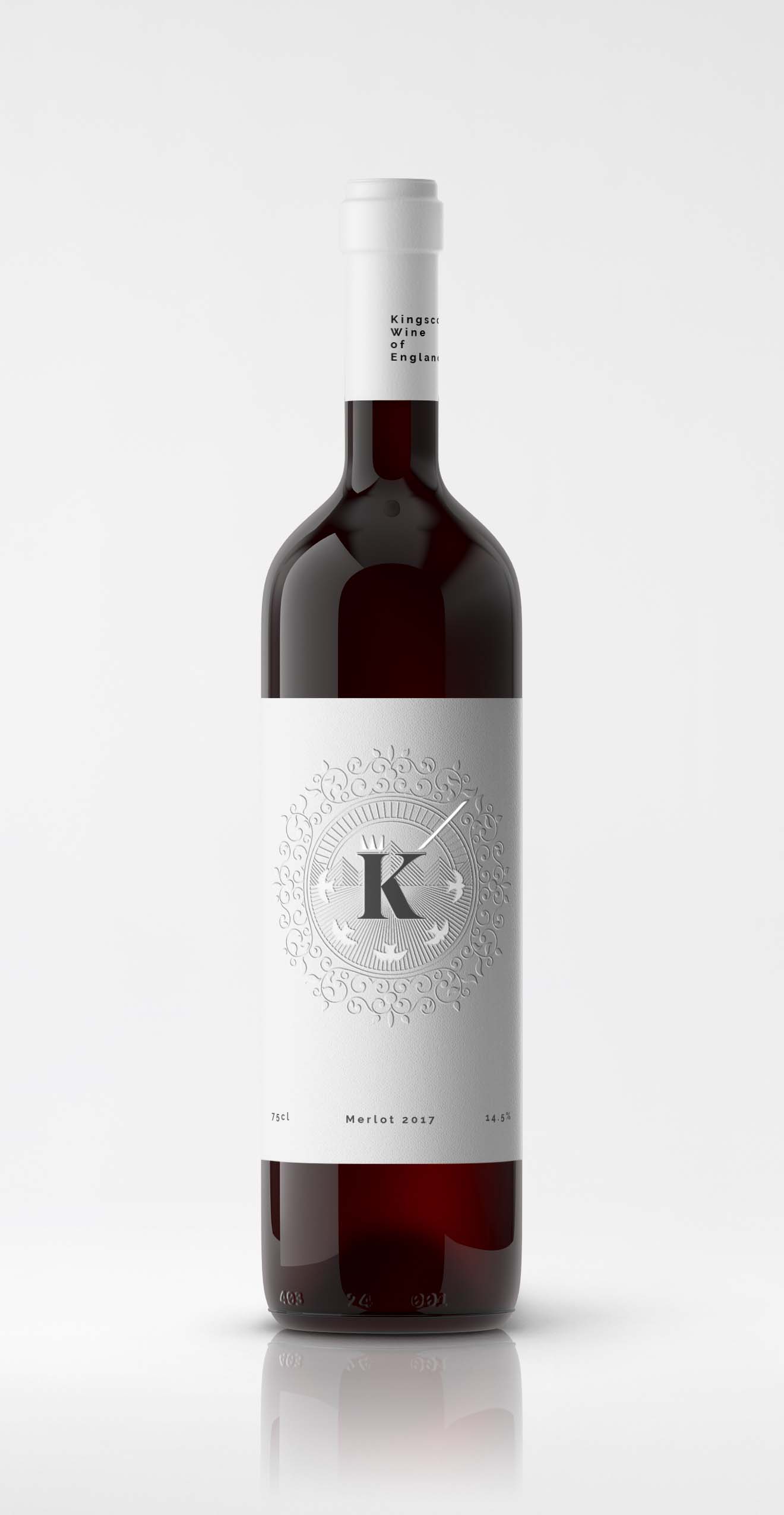
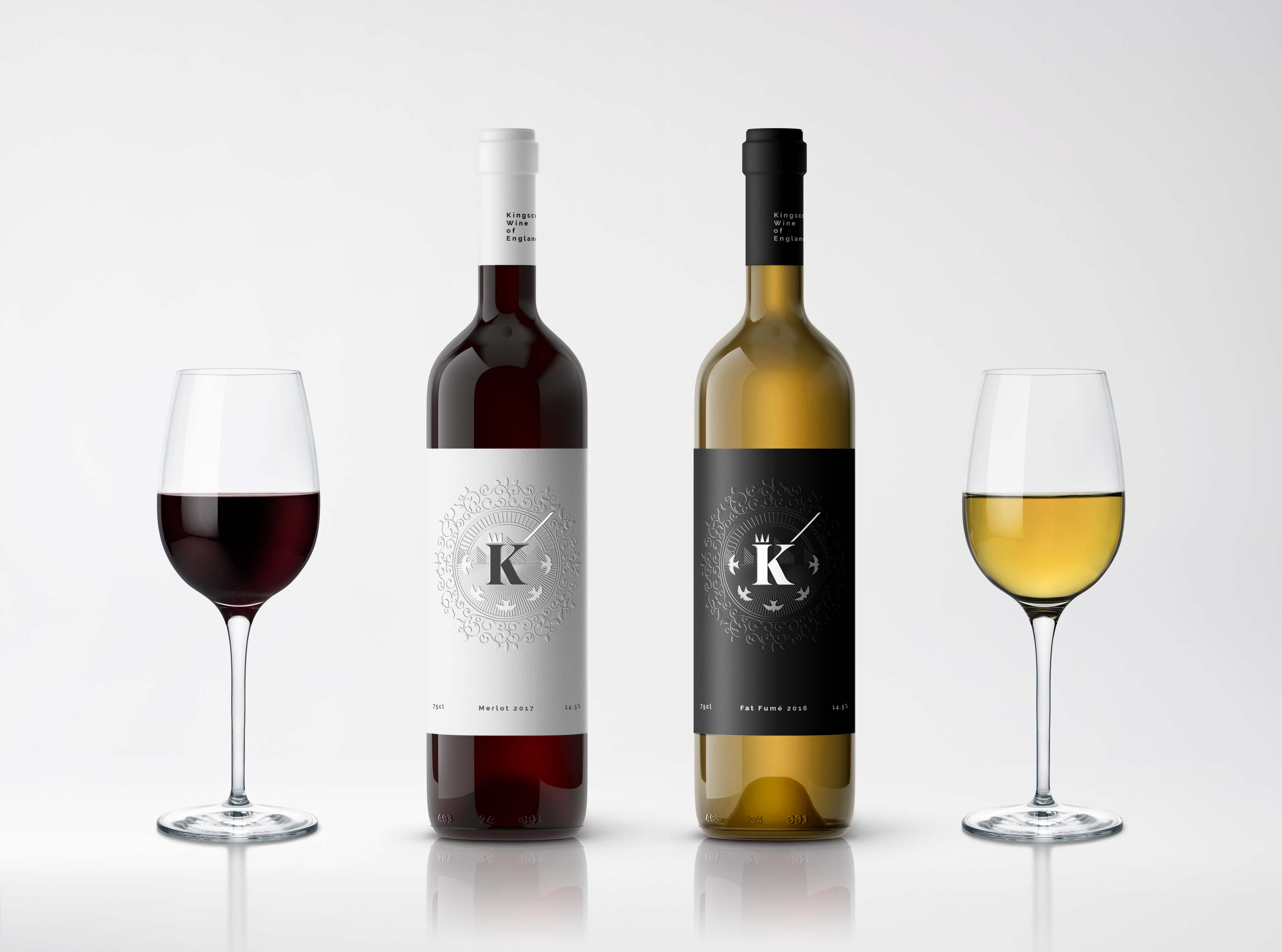
An iconic bottle
A minimalistic label designed to stand out to the shelf browser, and be memorable and recognisable. Whilst clean and modern, the design also communicates Kingscote Estates historical and regal heritage, for a customer with an appreciation of tradition.
Emboss, ink and foil
The embossed background speaks of the products premium quality and allows for ornate traditional details without interfering with the bold inked lettering. The reflective foil is used sparingly on just the crown and sword to highlight their material properties and catch the eye, and to a lesser extent for the shimmering feathers of the darting swallows.

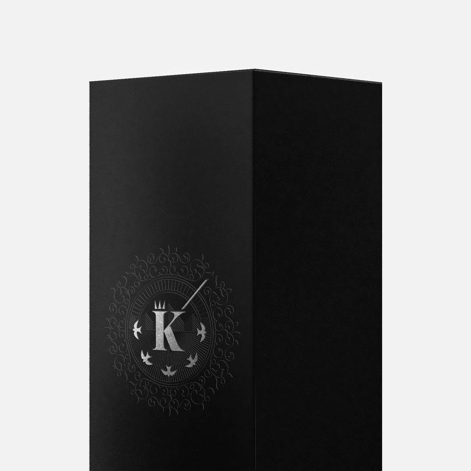
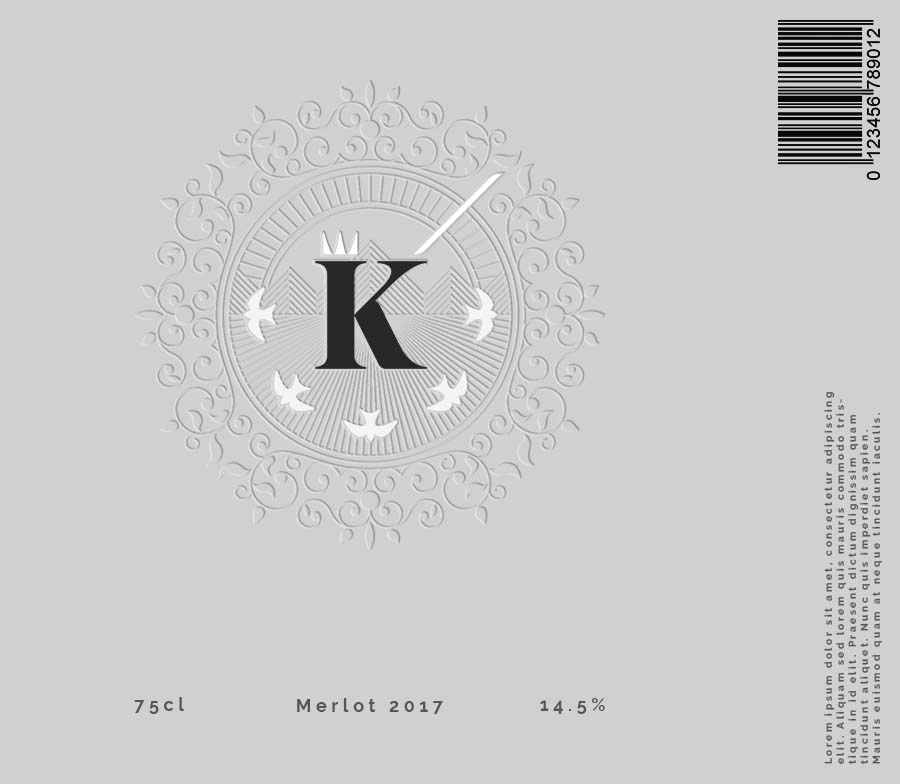
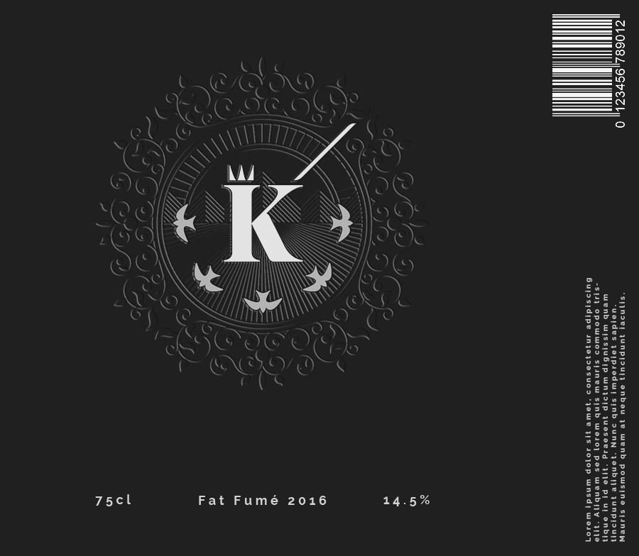
Constructing the logo
The K of Kingscote is the valiant king defending his land, with the crown atop his head and his sword held high, creating a strong association between logo and name. Behind him the sun rises over the rollings hills of Sussex, England, the very land he protects, and the plantations of Kingscote vineyard.


Everything Pete did we loved - He's the best.
Holly Dixon, Châteaux & Vignobles en Provence
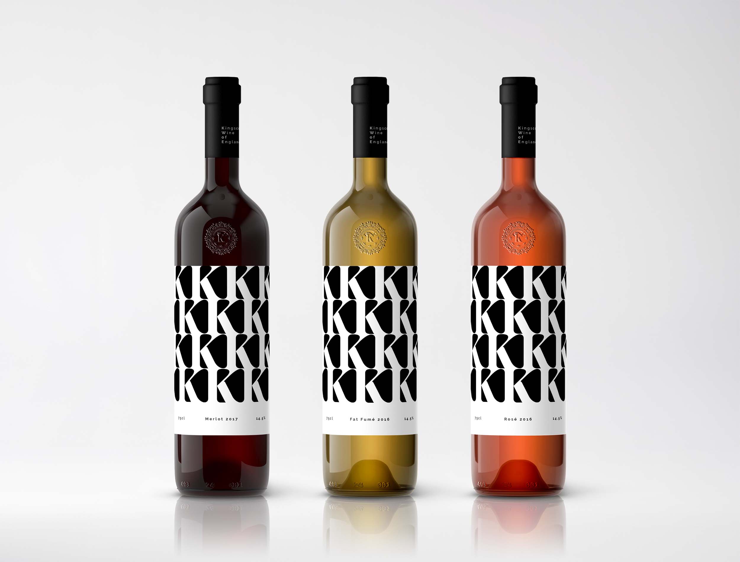
Limited Editions
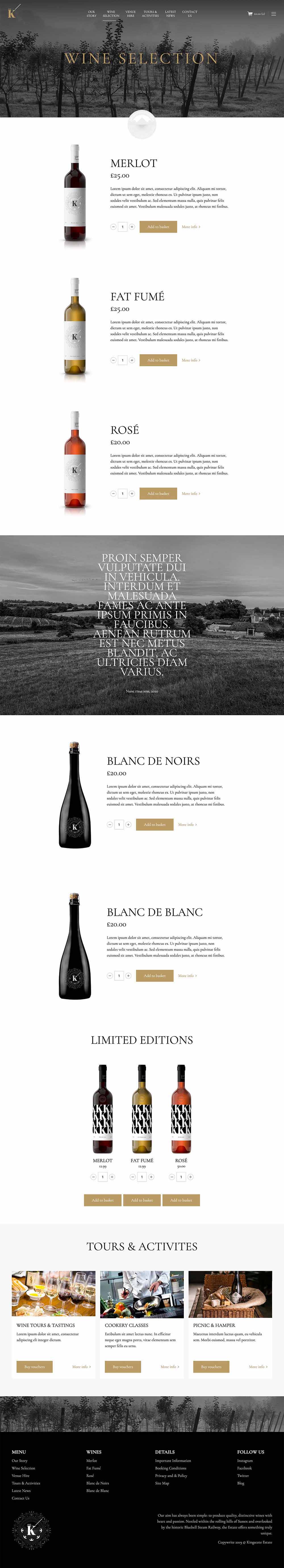
The Estate
A simple sophisticated site showcasing the companies portfolio of wines and the offerings of the Kingscote Estate. I wanted to move the brand away from the lifestyle approach (soft focus clinking wine glasses) a lot of vineyard sites focus on, and show the heritage, traditions and classiness of the estate that inevitably and invariably leads to producing a great wine product.
View live prototype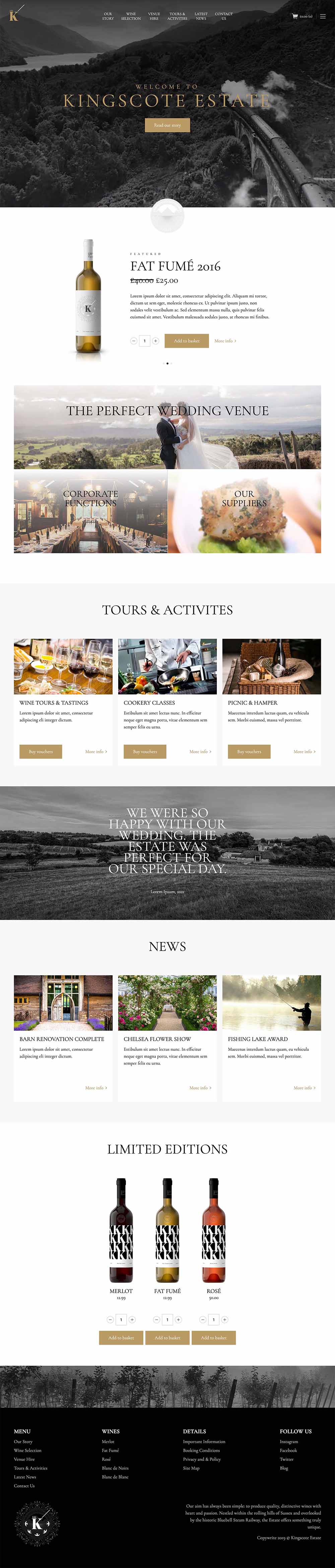
Website and content designed and built by Pete Moores © 2022