


The
UX
Fil
es


Some commercially focused UX projects utilising data insights, design thinking, behavioural sciences, interface design and animation.
- UX Design
- UI Design
- FE Development


Uno Home Loan Dashboard
An aquisition dashboard thats main focus was to encourage the provision of user information to subsequently recieve a more accurate and viable quote and ultimately improve conversions.
View Anima prototype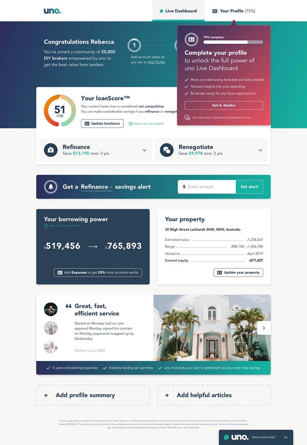
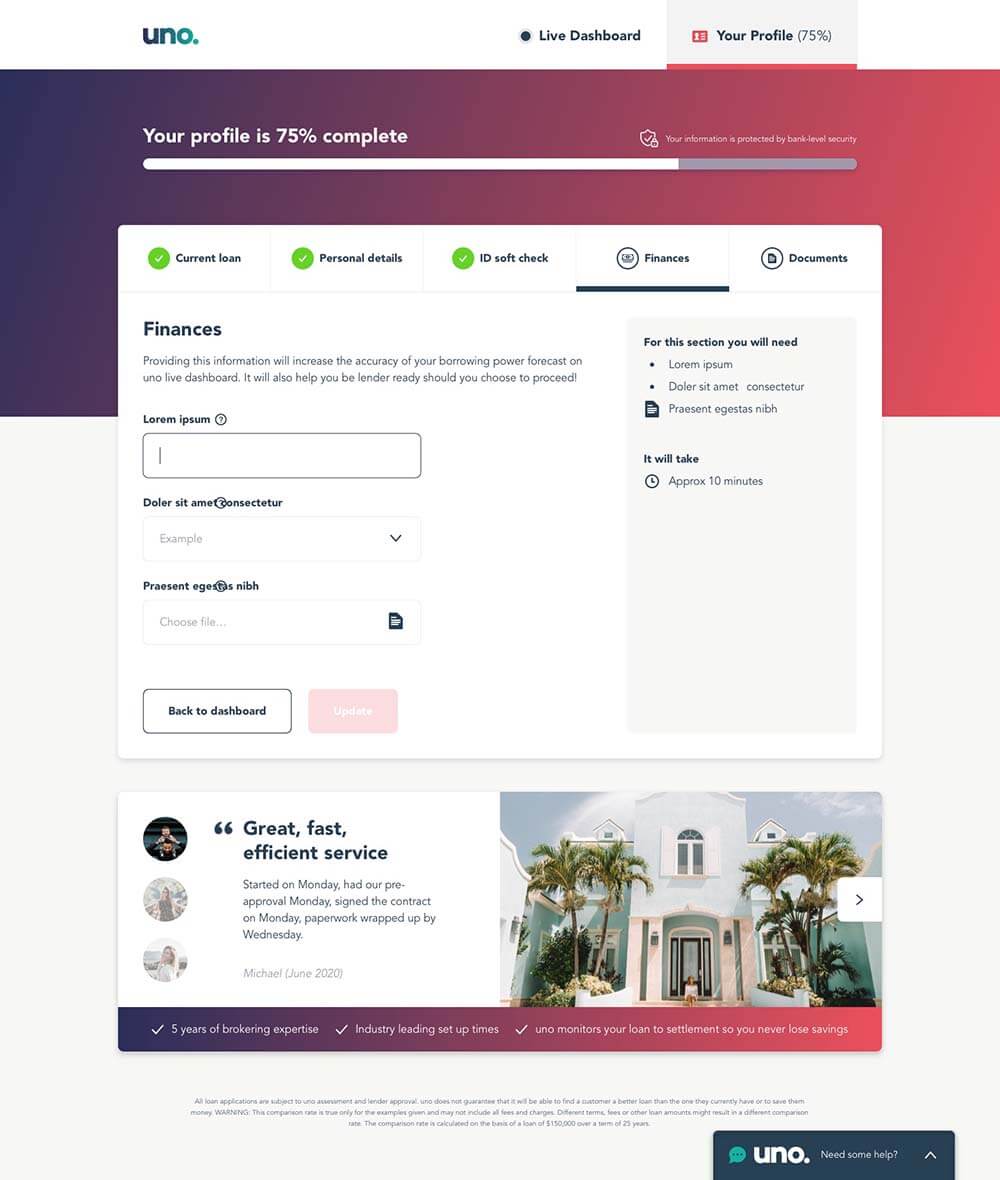
Healthy friction
The user is asked a couple of broad questions up front before being shown an initial dashboard that is populated with some relevant data. Whilst we land them on the more engaging dashboard to reduce bounce rates, the ultimate ambition is to encourage the user to build out their profile. After a few seconds we show them a friendly unintrusive modal highlighting the profile tab, it's function and benefits.
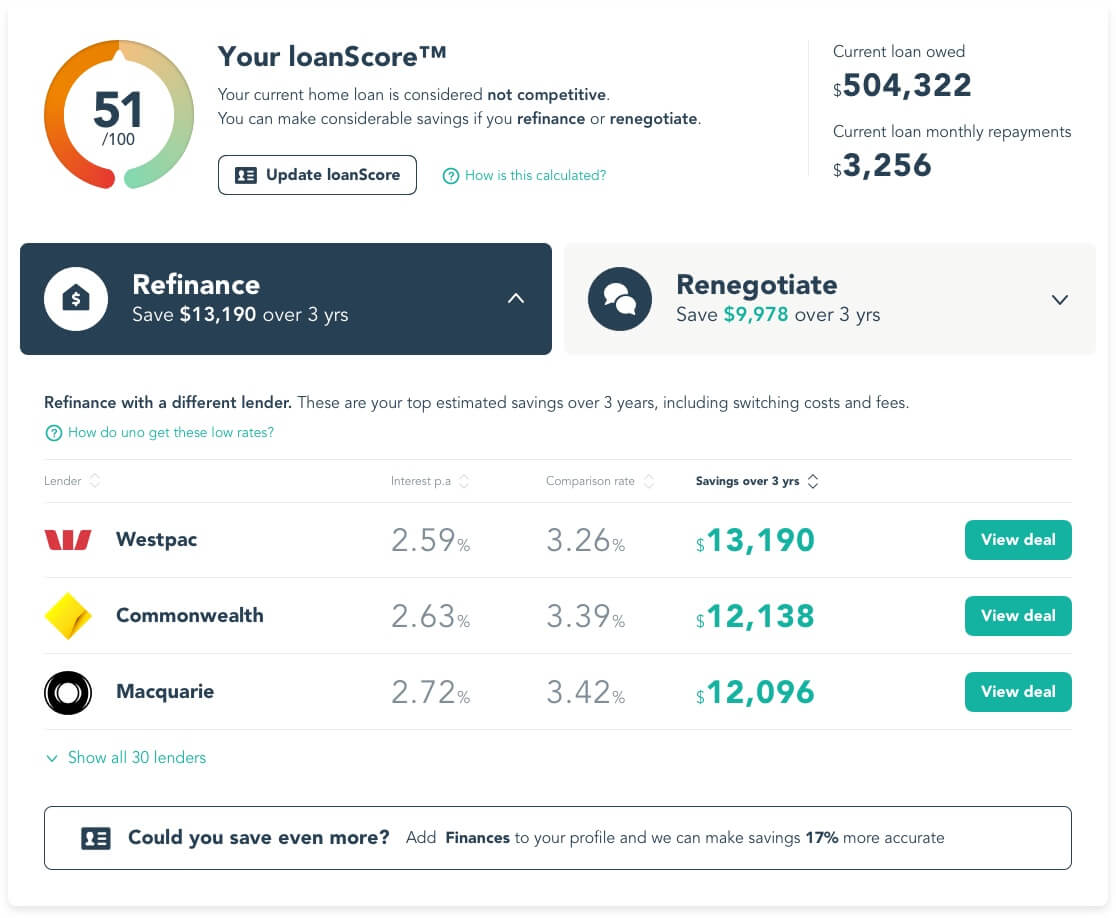
System 1
To reduce the initial cognitive load and keep the experience digestible the dashboard only surfaced some of the key information at it's top level. We utilised various mechanisms (tabs, tooltips, modals, adding modules) that enabled the disclosure of more information in a sequence controlled by the users needs and actions.
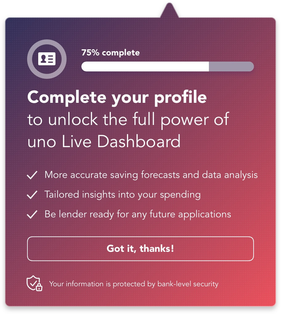
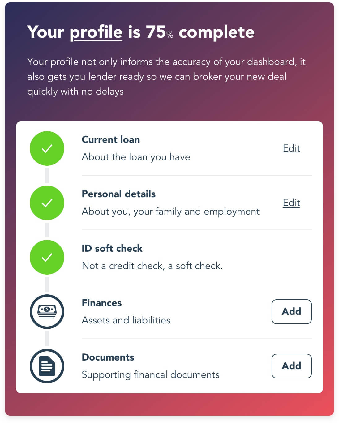
Completion theory
A completed profile was also important so Uno could act on eventual applications efficiently. The volume of information required for this wasn't inconsiderable. We utilised progression bars and checklists to encourage completion and also provide a transparency to the process and build trust.
Contextual prompting
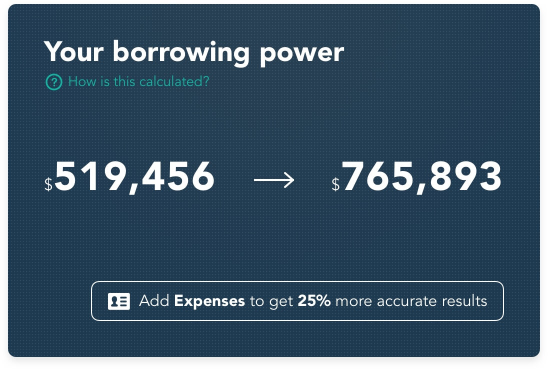
We lobbied the user for more information contextually throughout the dashboard, showing them how valuable their profile was in informing the data that was of most interest to them.
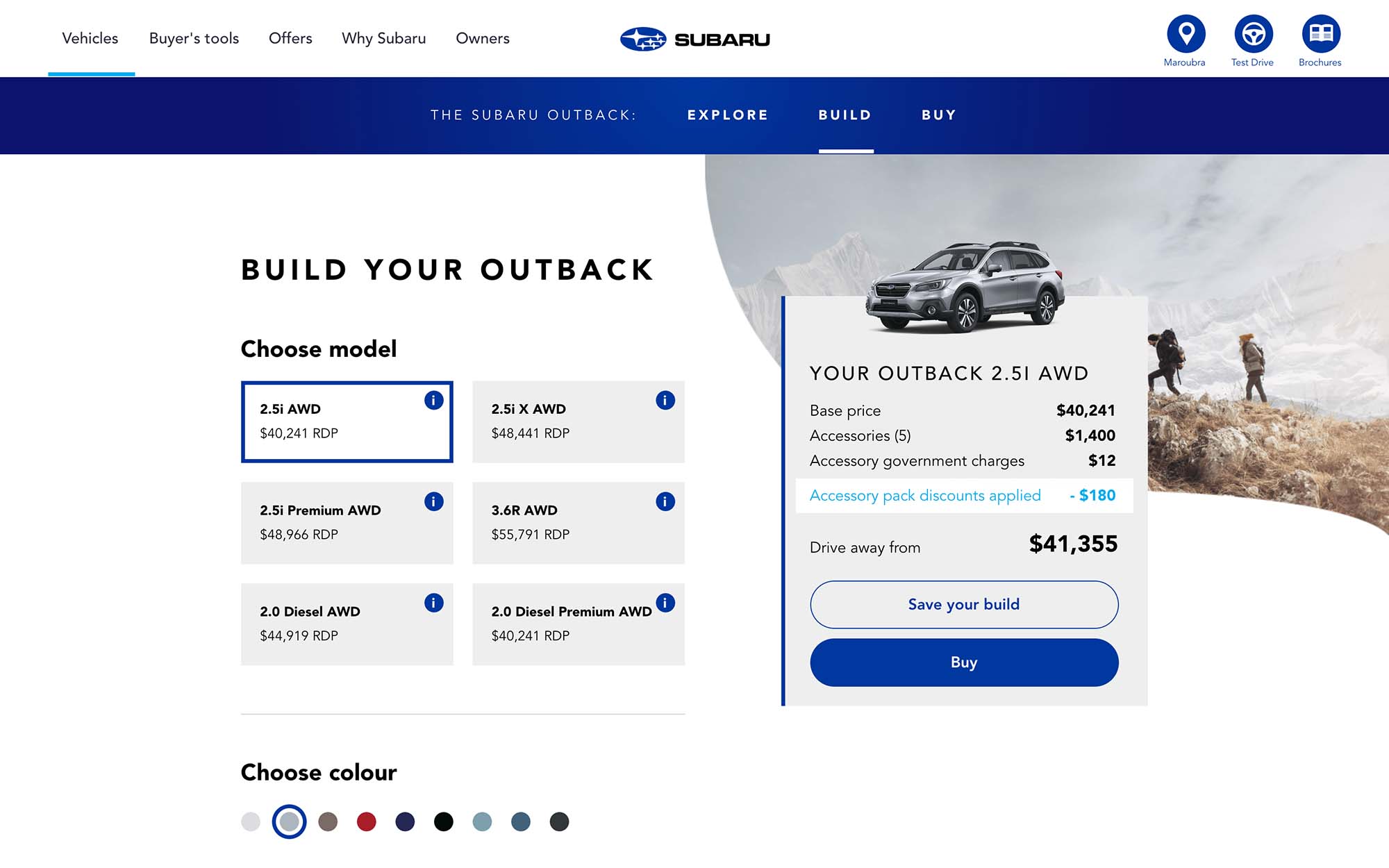
Subaru boilerplate site
A conceptual website for Subaru built from a solid base of a small number of components that were designed to be flexible enough to allow for growth through testing and personalisation campaigns, but with enough rules and limitations to keep the site from accumulating too much debt and aesthetic inconsistencies.
View Anima prototype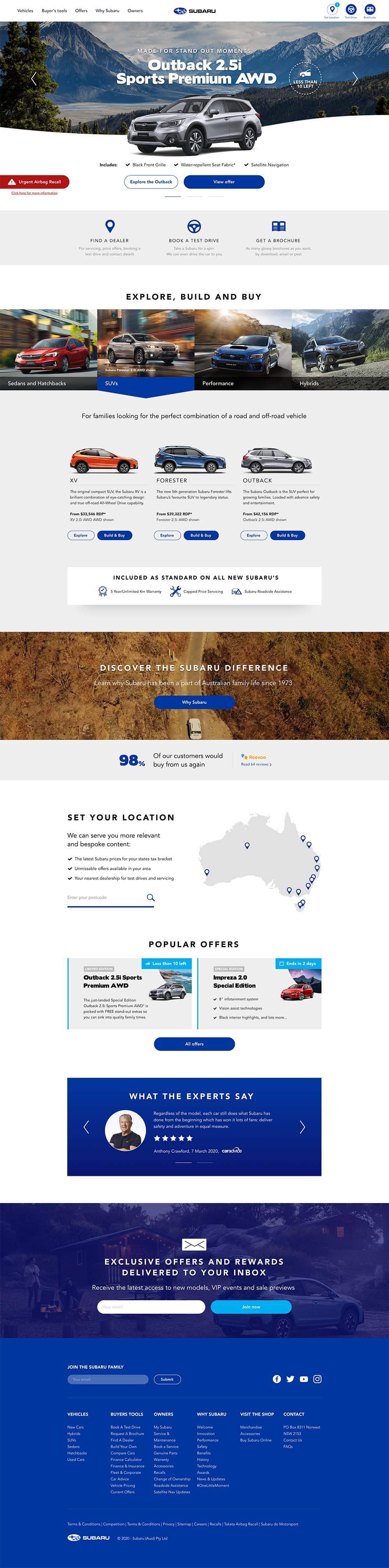
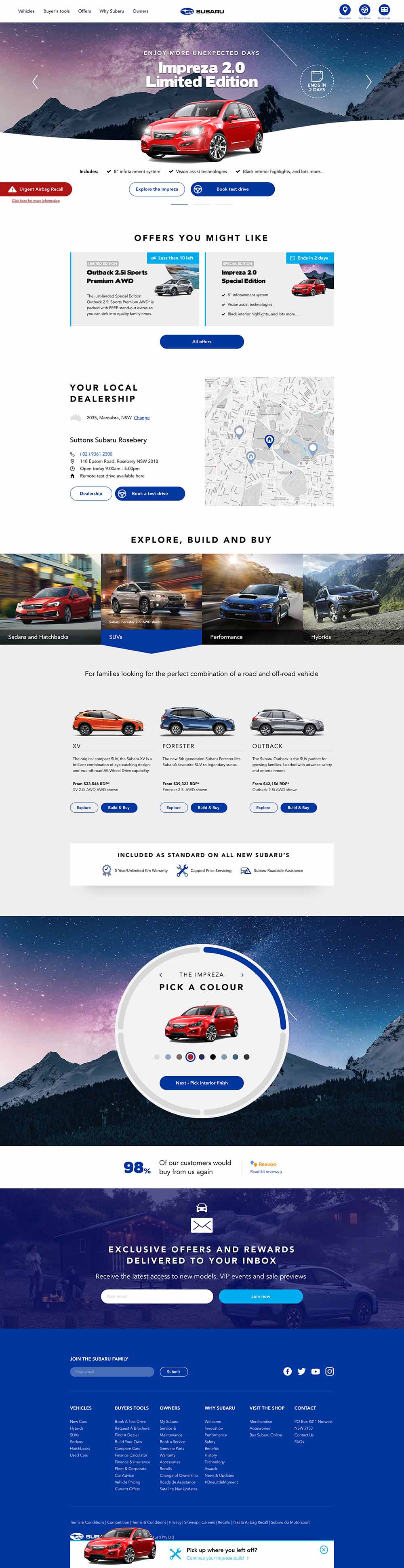
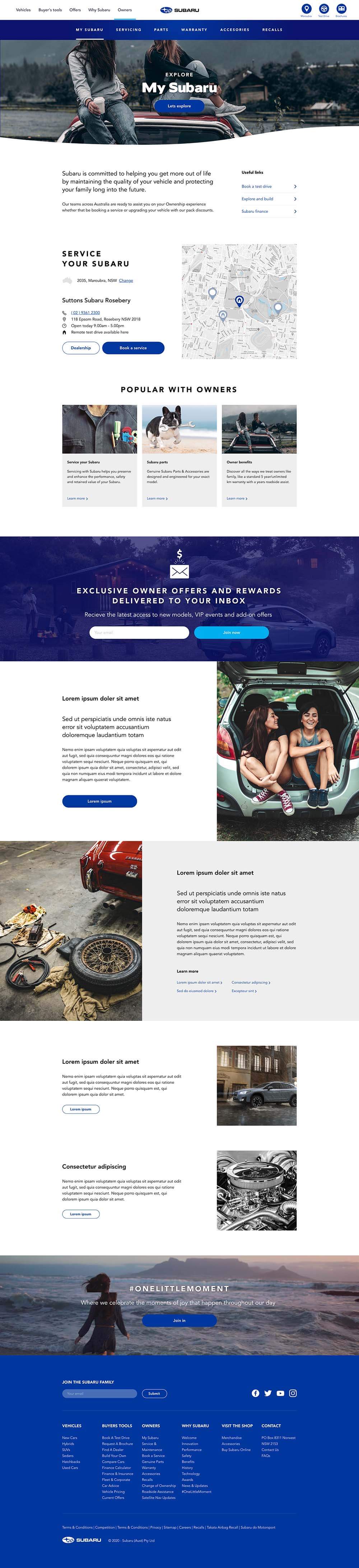
Orientation
The buying journey on vehicle websites can get diluted with the various different micro journeys vying for attention. These other journeys (test drive, data capture, postcode, promotions) have a lot of conversion value, but laying out the basic process in a sequence of progress tabs on the product pages and main navigation helps the user remain orientated in their ultimate journey.
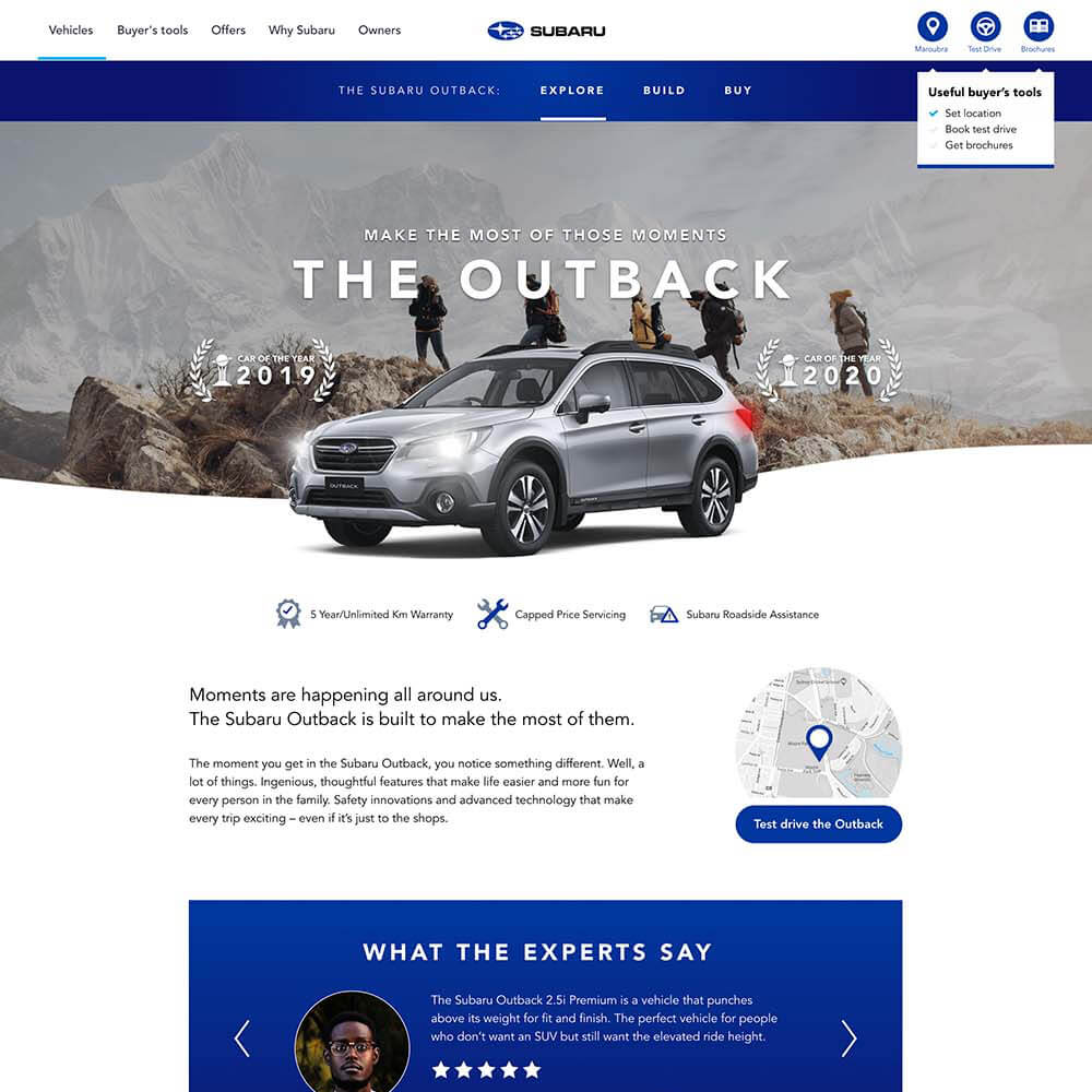
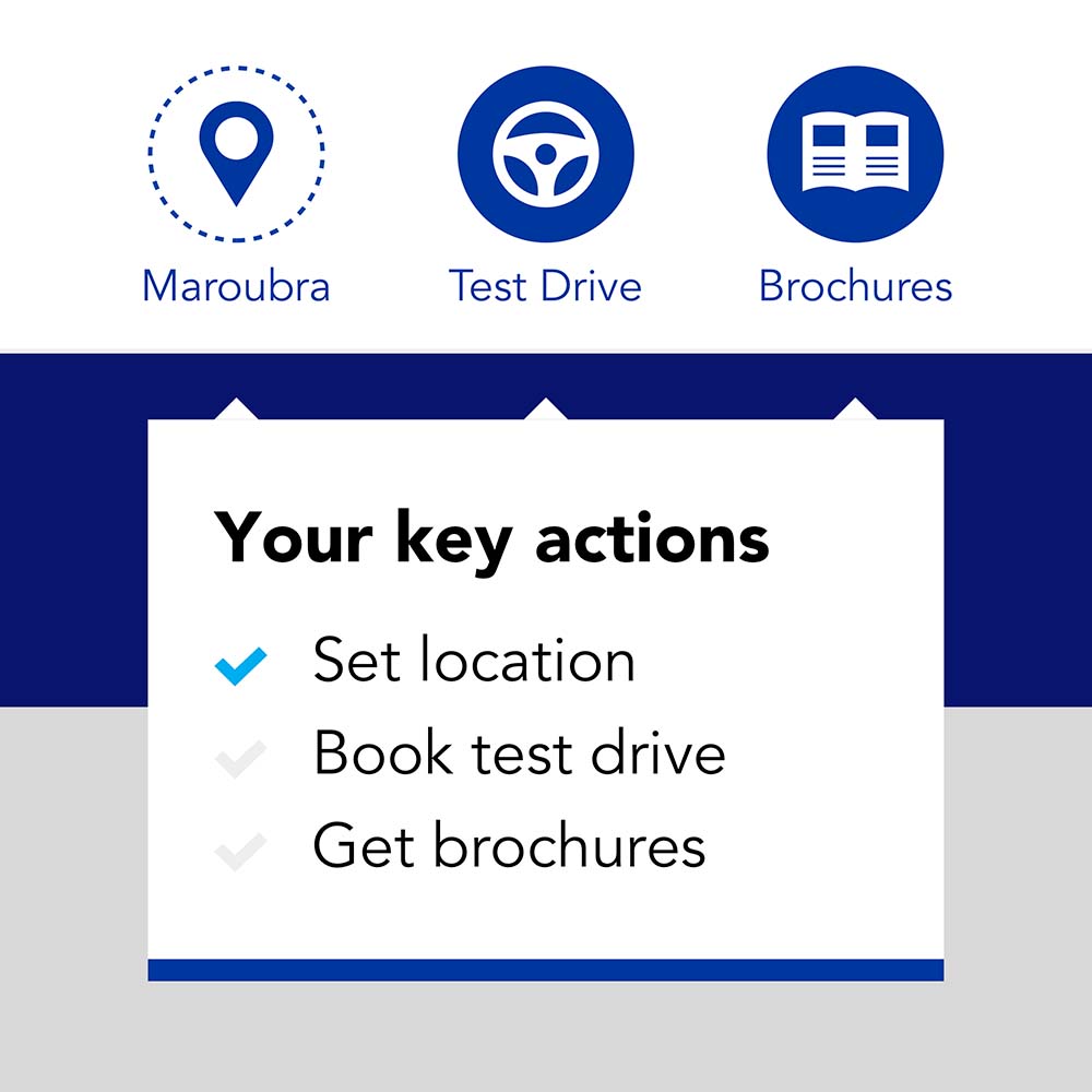
Omnipresent actions
Important global actions that aren't neccesarily journey specific share the sticky header with the site navigation.
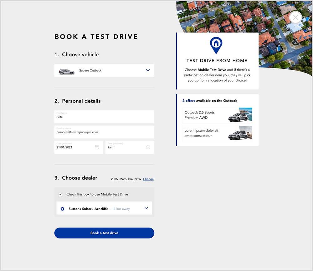
Staying in the journey
Actioning one of these then provides the user with the relevant form in a modal, thus enabling them to comfortably toggle between their journey on the site and completing and submitting these forms.
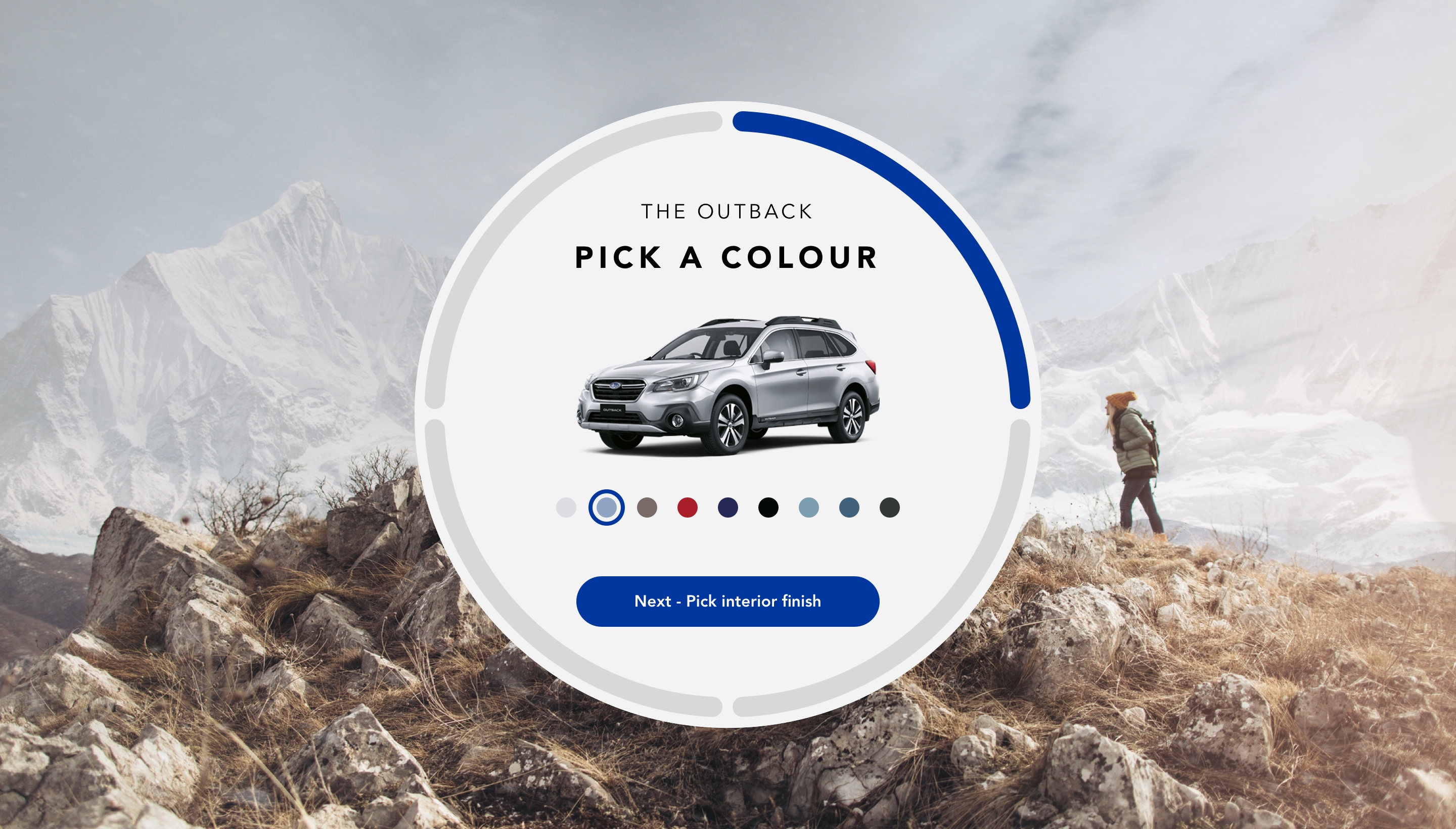
Surfacing the funnel
Once the user starts to personalise a vehicle the chance of conversion increases considerably. This interactive component that initially lives on the product description page enabled us to entice the user into the building funnel. If a user had visited a particular model page in a previous session, they could also be served this component in a prominent position on their returning personalised homepage.
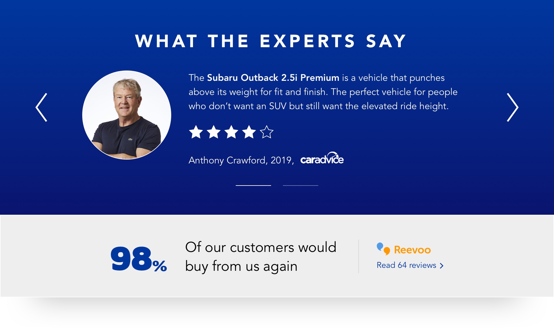
Authority
Positive reviews from industry experts and independent social proofing is presented in a module that is elevated from the page.
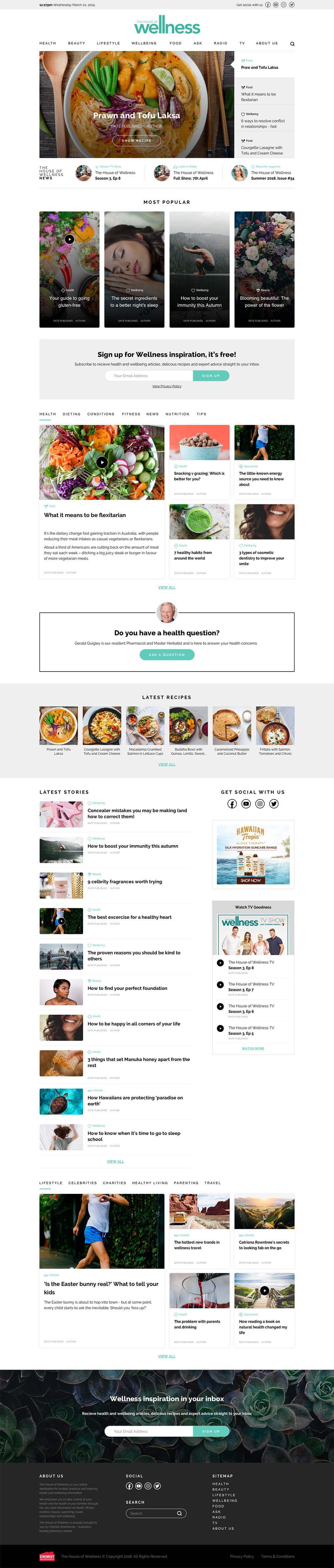
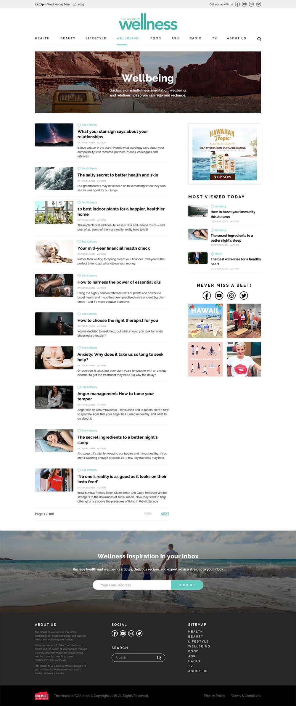
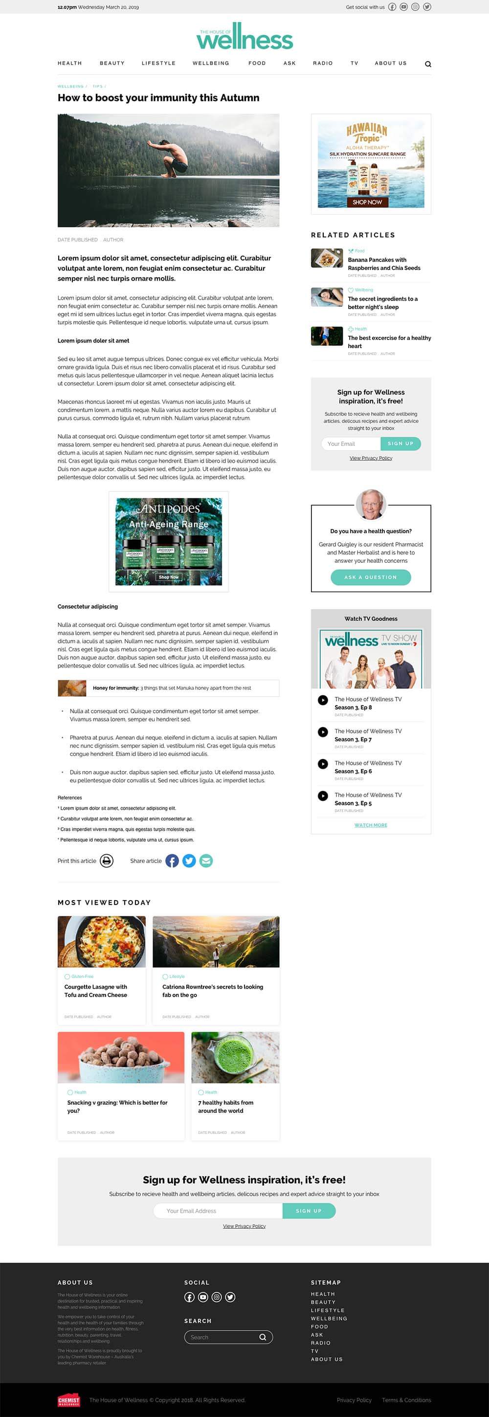
House Of Wellness Magazine Templates
A set of components and templates for the popular Chemist Warehouse owned content site - House of Wellness.
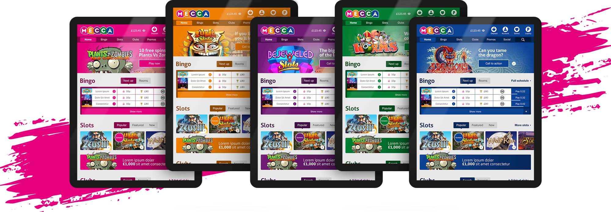
Mecca
The largest bingo provider in the UK. The website required a complete re-design to create a more manageable and sustainable digital offering. To appeal to a larger demographic, we wanted to move the brand away from vibrant pink without alienating the existing customer base. The solution was to create a design where the user could choose the base colour of their experience from the pallete of the Mecca logo. It also added to the playfulness of the brand.
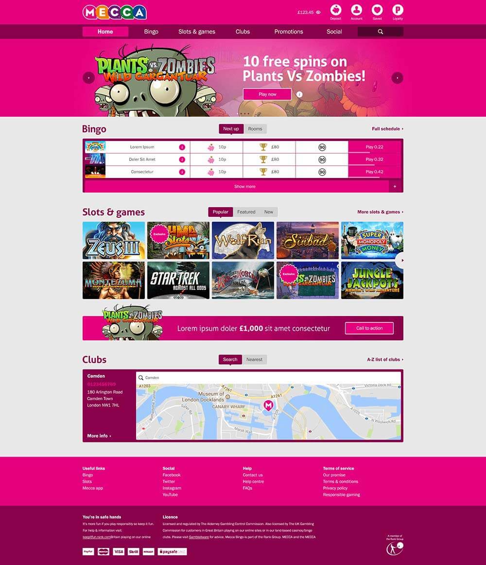
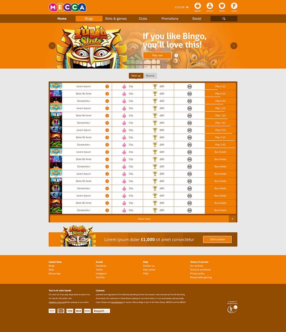
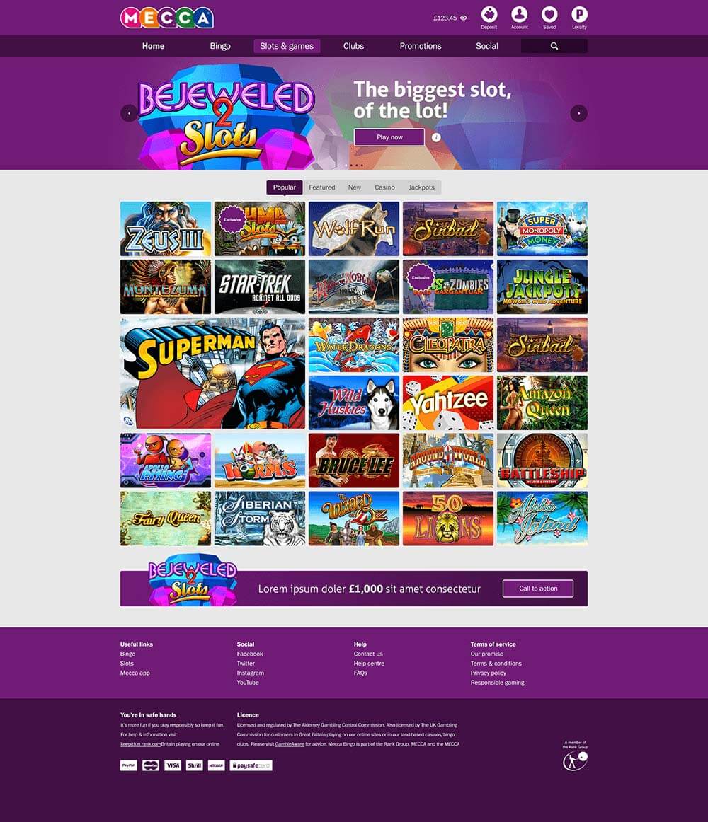
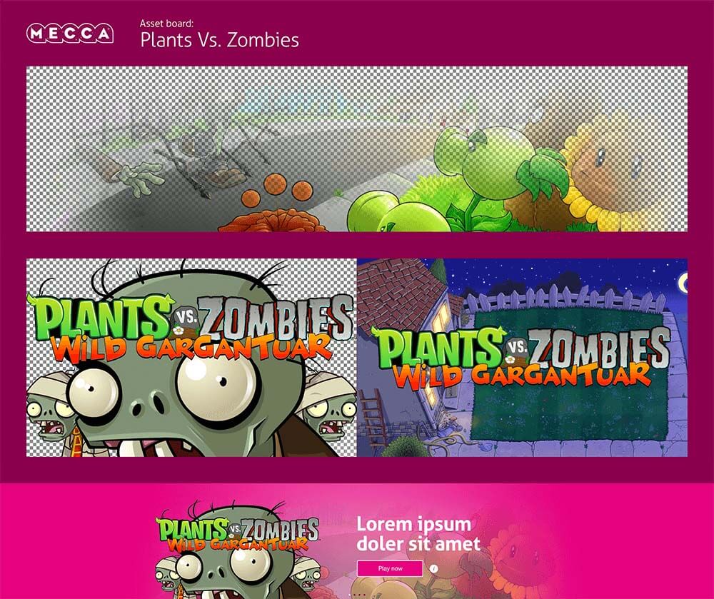
Minimise content
One of the biggest drains on resource from the previous site was the asset creation. Creatives spent most of the time resizing promotions and imagery to populate the site. The new site was based on only three images with set ratios, allowing creatives to concentrate on being creative, with any resizing performed automatically by the CMS.
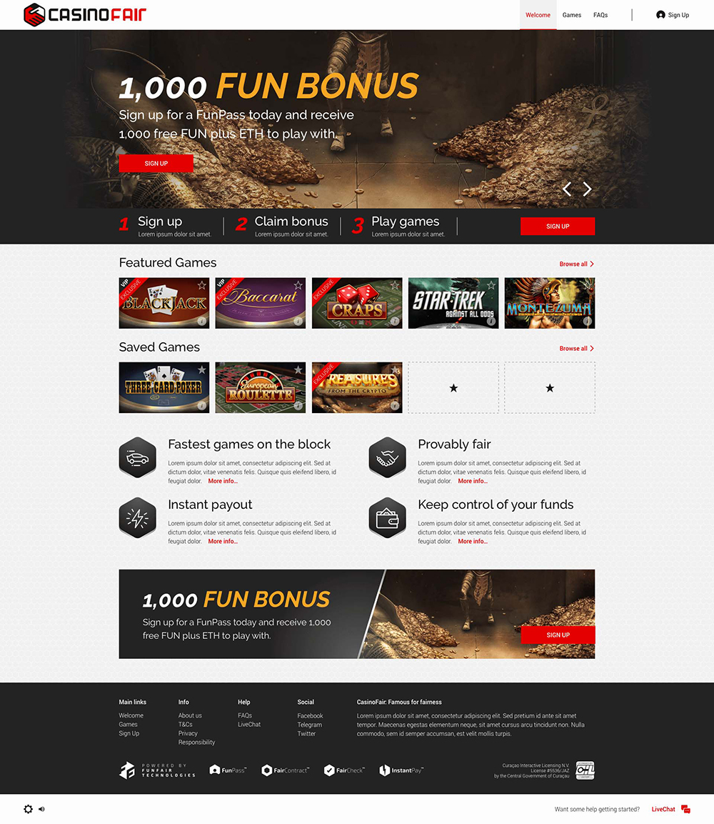
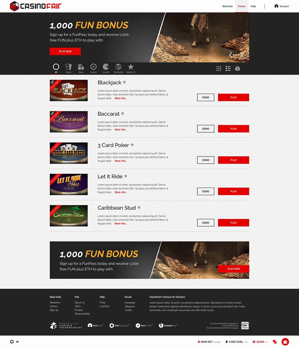
Funfair
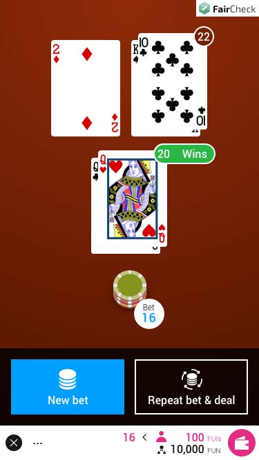
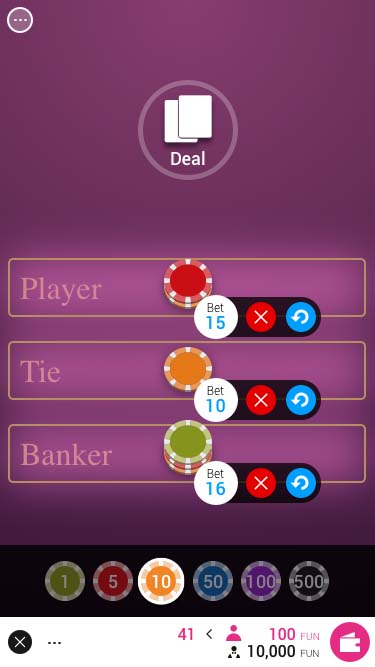
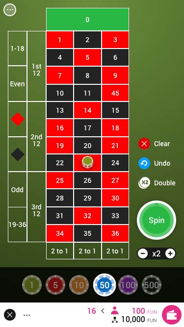
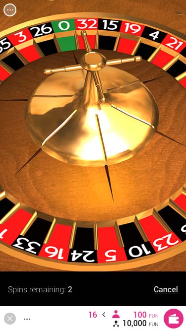
A UK startup that utilises the blockchain to provide casino and slot games that are provably fair. They required full UX/UI of their launch product. The main visual goal of the white label casino template was to easily absorb the brand of any third party operator, whilst giving the appearance of being unique and bespoke to that brand. To expediate development it was largely built on Google's Material library.
View live prototype View branded example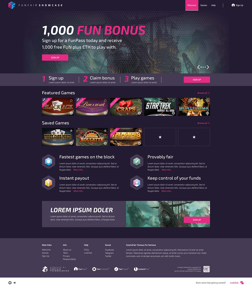
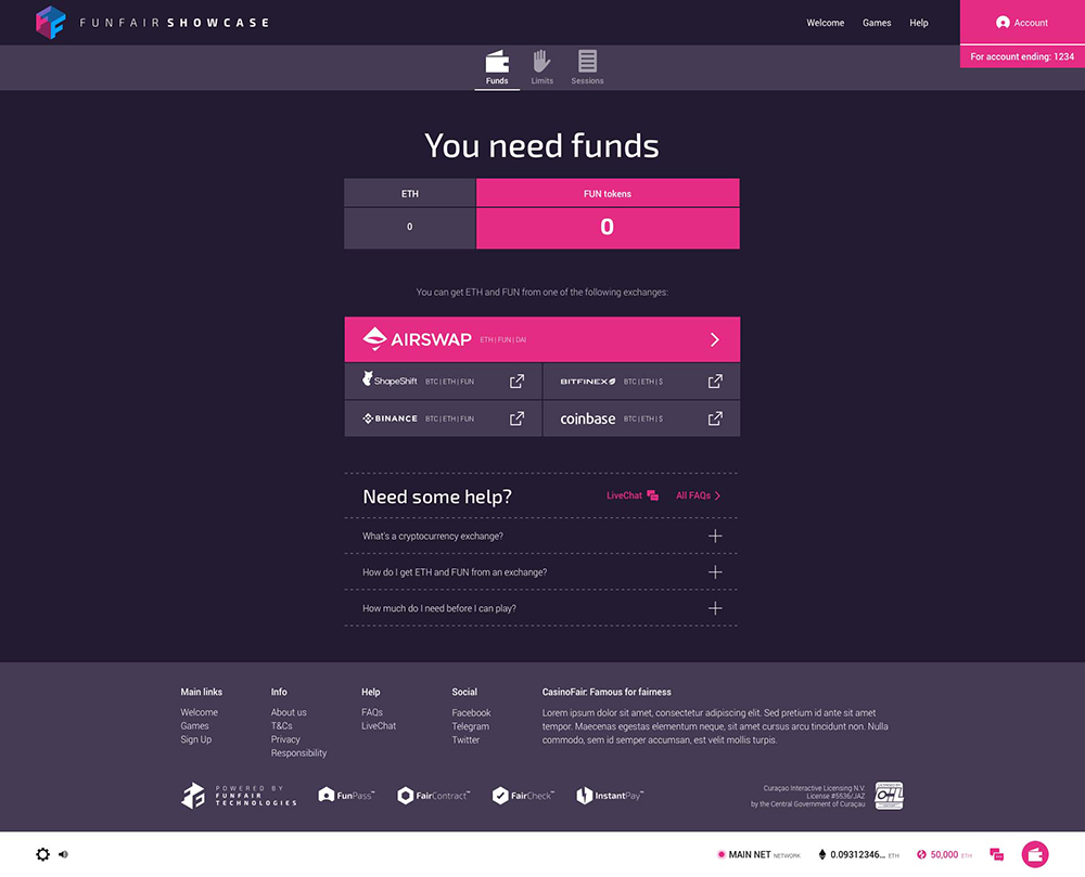
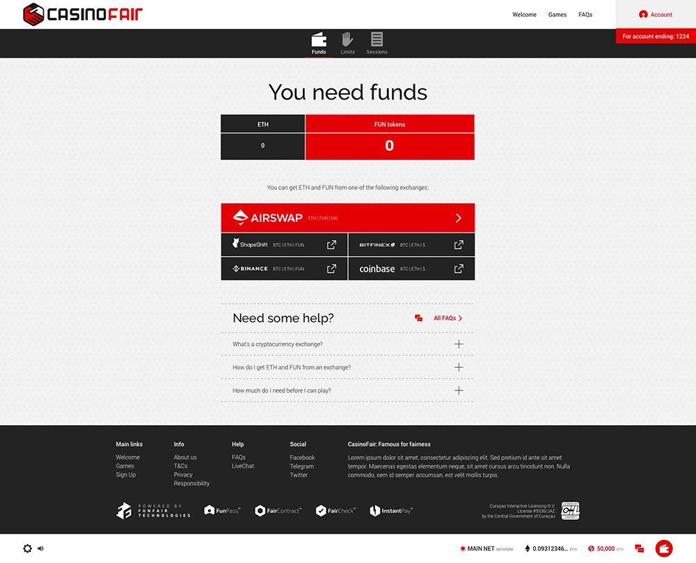
A challenging onboarding
The initial MVP was for a tech savvy persona accustomed to the intricacies of a blockchain onboarding. However future proofing was key and we needed to make it as accesible for a novice as possible. The onboarding process took at least 2 days for the user to complete and a large chunk of that was off site, so we had to keep them as informed as possible. As this process was lengthy it was important it didn't interfere with browsing the site and accessing demonstration versions of the games. The onboarding tab was always accesible so they could check their progress and if they performed any actions that required full onboarding they would be taken to this section as a reminder.
Axure prototype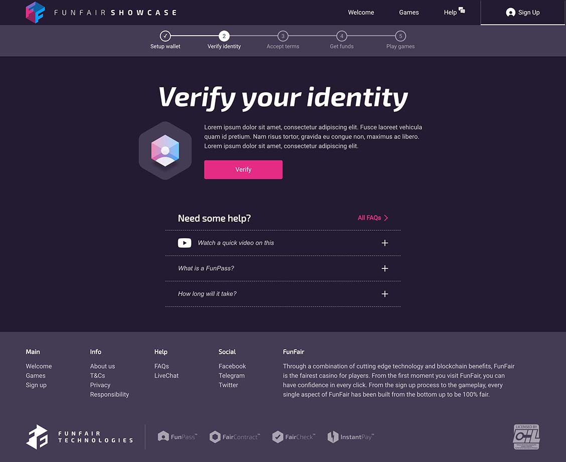
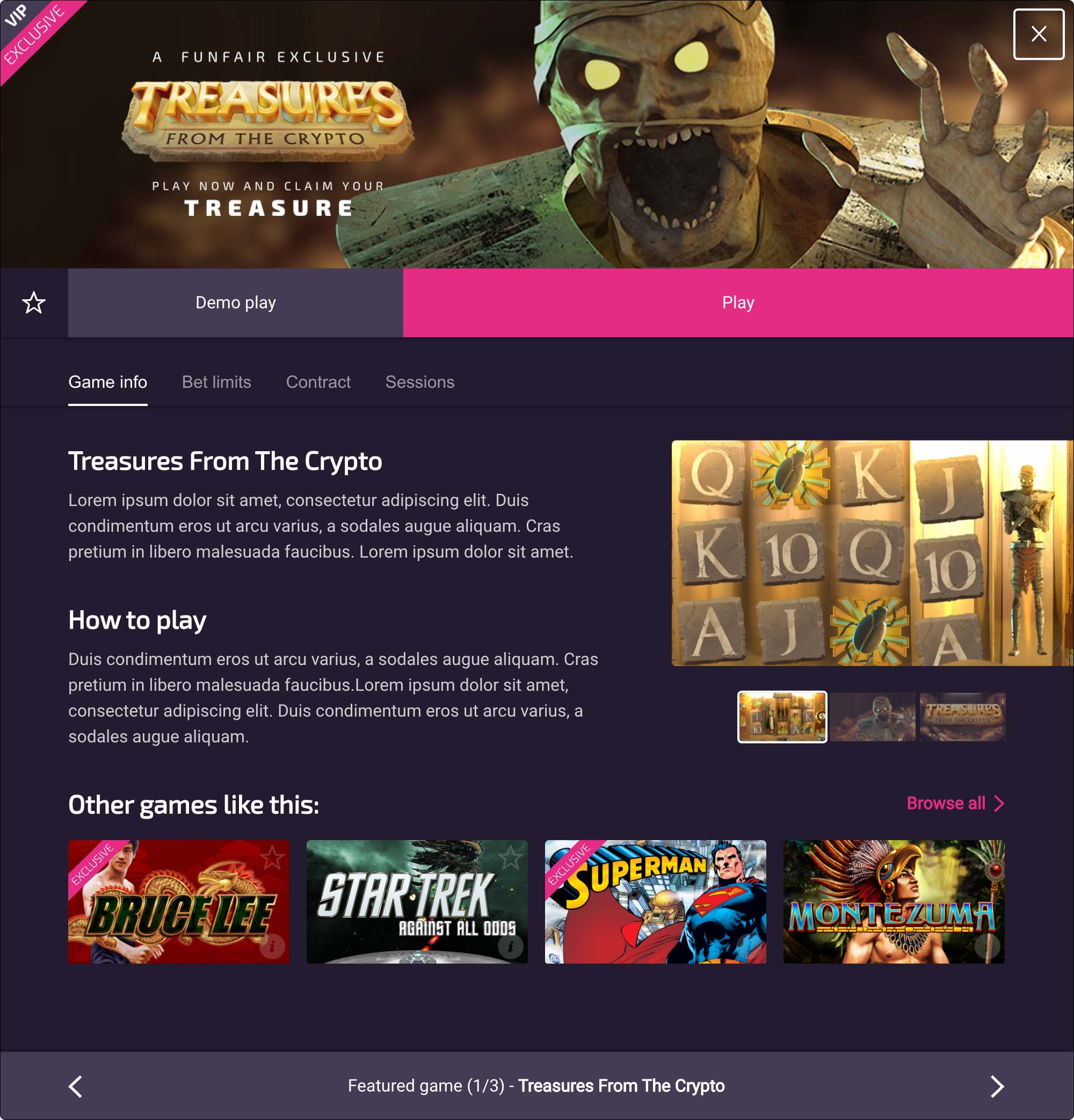
Familiarity
Once the game details modal is open it can remain so whilst the user browses through the active content list.
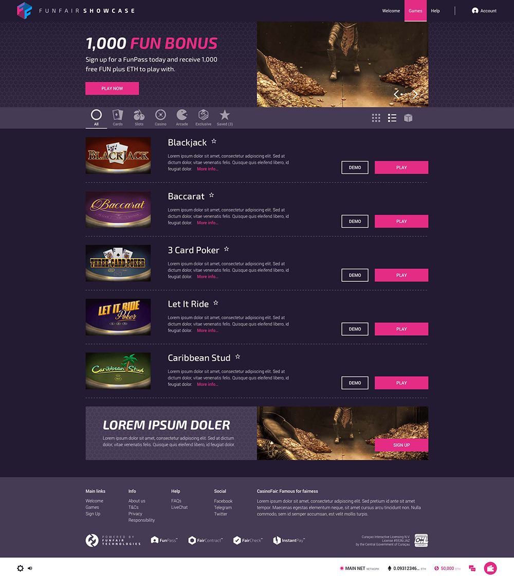
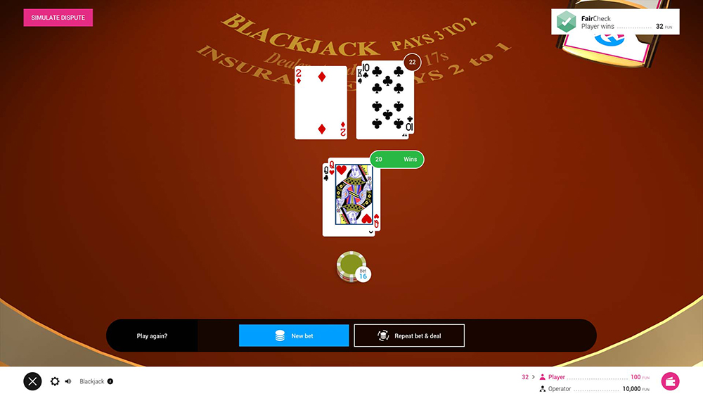
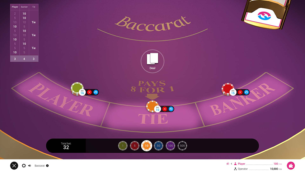
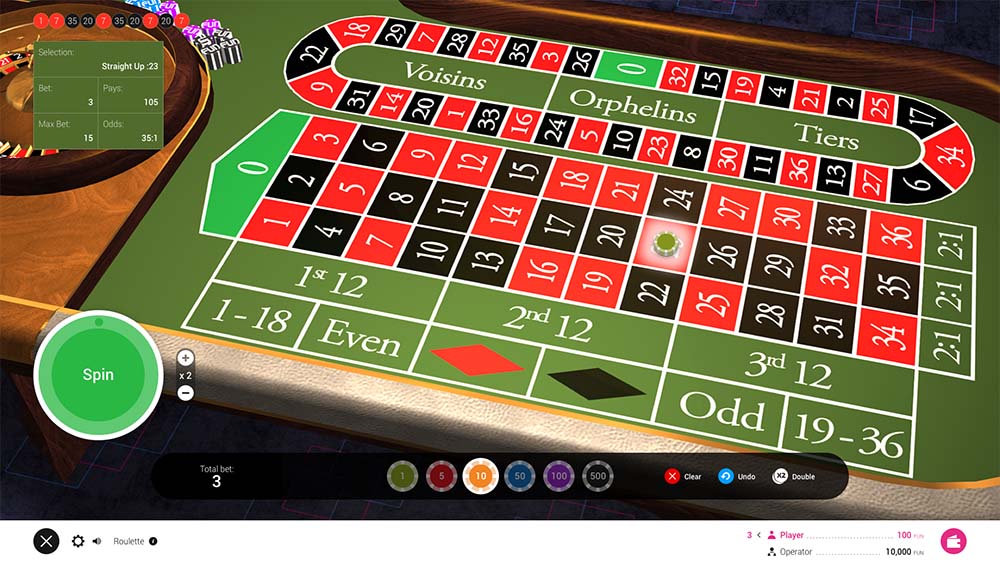
The games
The casino games required an interface that was fully responsive and had an aesthetic consistency with the casino lobby.
Website and content designed and built by Pete Moores © 2022